Oscar Wilson is influenced by the BMX and skateboard cultures from the 70’s and 80’s as the graffiti art form plays a big part in his artworks. His work is mainly hand drawn letter forms where either single words produce the shape that is described or a variety of words and phrases are used to represent a larger silhouette also his hand painted graphic pieces are produces on a large scale in order to capture all the detail. Wilson’s artwork is featured in advertising on Crisis, Visit London as well as Sky TV. In 1994 Wilson has graduated from Leeds University with a degree in Graphics Printmaking and in 1996 he has opened his studio where he was also working at Advanced Graphics London.


Photograph on the left: This is a hand painted graphic piece of the classical Red Bus in London, the words that Wilson used o produce this graphic piece are names of paces in London such as ‘Hyde park’ and ‘Euston’ as well as ‘Bond’ because James Bond was filmed in London. The colors that have been used in this piece are red and grey tones in order to make the silhouette look like a bus. The typography has that graffiti touch to it as the letters and some words are curved in order to make the shape of the bus. This artwork makes me feel happy because it has inspired me to produce my own work in the style of Wilson and shows me how I could manipulate the typography in order to make my silhouette look 3D.
Photograph on the right: This is another hand painted graphic piece which represents a guitar. Wilson has used a variety of warm tones of red and yellow to produce the body of the guitar along with beige/brown for the neck and white and black tones for the small parts. The typography has been drawn in the way to form the smooth curves on the instrument as well as to add in phrases and words to describe the guitar. This artwork also makes me happy as I play guitar myself but also it inspires me to go on to produce my own artwork in this style.
David Carson is well known for his contemporary magazine design and typography he also used to be and art director of the Ray Gun magazine where he applied lots of his well known typography into the magazine itself. Carson is an American graphic designer, surfer and art director. His style is very unique as he uses wordplay in his work where he rearranges the letters in the word or phrase which often makes the artwork look like random letters but the brain addresses this and lets us read it without trouble.


Photograph on the left: This is the ‘Carson’ inked typography work. Although it doesn’t look like it by the way the letters are arranged its quite easy to read it. For this piece of work Carson has used inks and stencils which gives the work an old looking outcome which looks appealing. The colors that have been used to produce this typography piece are brown and black tones as in some areas the letters are brown almost orange and in some they are black. This artwork makes me feel excited to produce my own work in this style as its quite easy to produce and the outcome of it is amazing as you never know how much ink will actually stay on the paper and this depends on how much pressure is applied.
Photograph on the right: This is the ‘Don’t Mistake Legibility For Communication’ graphic work. This is one of the well known artworks by Carson. The typography in this artwork is upside down and it looks like the mirror reflection. Looking at this work it is quite hard to tell if this was produced digitally or by hand and the tones that have been used are black and white where the positive space of the letter is which and negative black. The shapes and lines on this piece of work as bold and symmetrical applied using think strokes. This photograph made me think what Carson was trying to say as my brain didn’t quite click at first but when it did I was able to read the word with no problem.
I haven’t had the chance to complete the David Carson work before the deadline but I’m aiming to complete it during the Christmas break and insert the letters produced into the booklet.
During this workshop we have looked as at these two artists and how their artwork was different from each other, Oscar Wilson inserts words that are associated with the item that he is trying to create adding in lots of different tones to produce his artwork whilst David Carson uses the stamp method to produce his typography meanwhile using the wordplay as it hard to read his artwork but our brains are able to read it with no problem.
Own work


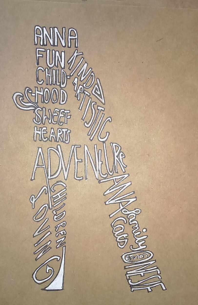
The photographs above represent my planning in my sketchbook. The first letter that I have done was ‘K’ which I then went on to do as my final piece for this artist.Firstly I went on to outline the letter ‘K’ in pencil so that I had a frame that I could put my words into to make the letter. Once i was happy with the measurements I started writing words within the frame ,with a white pen, that describe me. When I filled in the letter with words I took a black pen and started outlining the letters which gave it a nice effect. I have repeated the same process with letters ‘A’ and ‘Y’ but when I went onto do ‘Y’ I decided to fill it in with y’s in different fonts which looks really nice. The letter ‘Y’ and ‘A’ were experimental letters that I’m going to put into my booklet later on.
The photograph bellow shows my finished final piece in the style of Oscar Wilson. I have really enjoyed doing this letter in the style of Oscar Wilson because I had a chance to make the letter really personal to me because it’s not only the initial of my first name but it also contains letters that describe me as a person. The process to complete this letter is the same as the one described above. 
